Dribbble Landing Page Inspiration That Merges Beauty with High Conversion
Key Elements of a High-Converting Dribbble Landing Page
A high-converting Dribbble landing page turns visual inspiration into a clear user journey: state the value proposition above the fold, create a strong visual hierarchy, place one primary CTA in a prominent position, support the claim with trust signals, and make the layout fast, readable, and responsive on every device. The goal is not just to create a beautiful concept, but to guide qualified visitors toward actions such as demo bookings, trial starts, form submissions, or purchases.
A quick scroll through online design galleries shows thousands of visually stunning concepts, but great design is more than eye candy. When we build high-performing digital experiences, we evaluate how every pixel directly serves user intent and business objectives. A conceptual interface might earn thousands of community likes, but a production landing page must generate qualified leads, demo bookings, and sales. Bridging this gap requires translating aesthetic experimentation into measurable customer journeys.
High-converting pages establish visual balance by directing a visitor’s eyes through a structured hierarchy. The core value proposition sits prominently at the top, supported by readable typography, intuitive navigation, and prominent call-to-action (CTA) buttons. Mobile responsiveness is equally essential; layouts must adapt smoothly across screen sizes rather than functioning only as a static desktop canvas. When designing for both visual impact and conversion rate optimization (CRO), designers must prioritize functionality without stripping away creative flair.
| Concept Feature (Aesthetic Focus) | Production Requirement (CRO Focus) | Primary Purpose |
|---|---|---|
| Ultra-low contrast grey body text | High-contrast WCAG AA compliant type | Enhances readability and prevents bounce rates |
| Hidden or abstract navigation | Clear, sticky CTA and standard header links | Reduces user friction and guides conversions |
| Unconstrained floating elements | Responsive CSS grid and container bounds | Ensures proper rendering across all devices |
| Generic placeholder metrics | Real customer reviews and verified data | Builds authentic trust and purchase confidence |
| Heavy, unoptimized 3D animations | Optimized lightweight motion assets | Preserves fast page load speed and SEO rank |
Hero Section Architecture and Visual Hierarchy
The hero section serves as the primary focal point of your entire page. Visitors form an impression of your brand within milliseconds of landing above the fold. Modern concepts frequently combine bold headline typography with custom 3D renders or distinct vector illustrations to immediately communicate product capabilities and capture buyer curiosity.
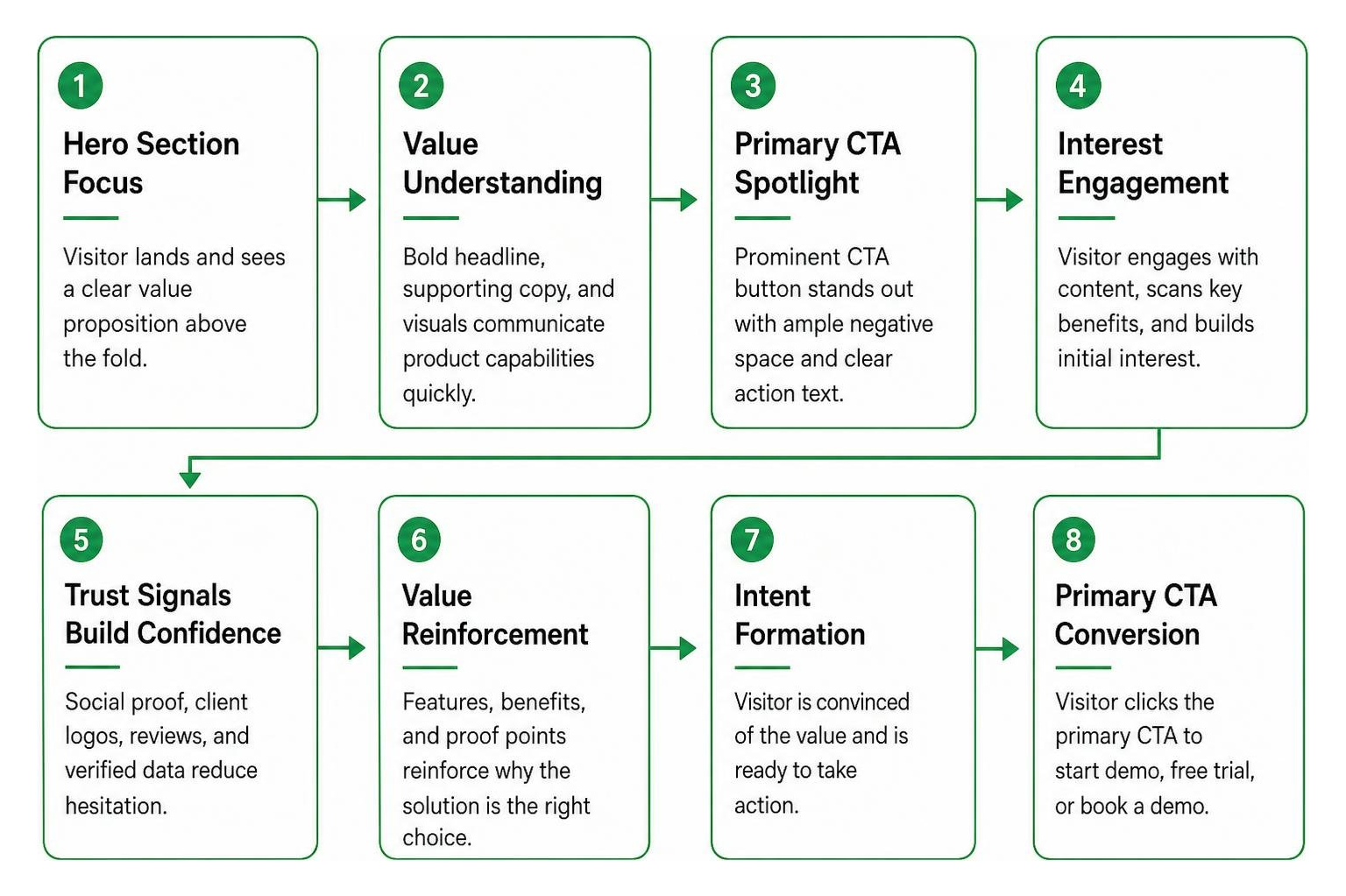
An effective hero layout pairs an explicit value statement with an unmistakable primary CTA, such as “Book a Demo” or “Start Free Trial.” Surrounding the CTA with ample negative space eliminates visual clutter, allowing the visitor’s eye to lock onto the desired action effortlessly. Secondary actions, like watching an interactive product preview or viewing pricing tiers, should be visually subdued to avoid distracting from the main conversion goal.
Social Proof and Trust Signal Layouts
Trust signals turn casual browsers into confident buyers. Top designers structure social proof using structured logo grids featuring recognized client brands directly below the hero section. Placing these elements above the digital fold assures first-time visitors that industry leaders rely on your solution.
Further down the page, floating avatar cards, verified customer reviews, quantitative data metrics, and industry security badges reinforce credibility. Using genuine customer feedback alongside realistic user photos provides authentic social proof that validates your product claims and alleviates buying anxiety across the entire decision funnel.
Top Trends Shaping Modern Landing Page UI Design
Web design aesthetics evolve rapidly, with modern landing pages embracing sophisticated visual styling that feels dynamic, tactile, and intuitive. Dark mode themes have gained massive traction, offering an immersive backdrop that makes vibrant accent colors, glowing gradients, and crisp product interfaces pop. Designers also rely on subtle depth cues, glassmorphism overlays, and card-based UI architectures to neatly segment complex feature sets into scannable, digestible chunks.
Modern Typography and High-Contrast Color Palettes
Typography sets the emotional tone and structural clarity of a digital brand. A popular typographic trend pairs clean, modern sans-serif fonts like Neue Haas Grotesk for crisp headlines with timeless serifs such as Source Serif Pro for editorial accents or section subtitles. This juxtaposition creates a sophisticated aesthetic balance that feels both authoritative and approachable.
Beyond style, color palettes must adhere strictly to Web Content Accessibility Guidelines (WCAG) contrast standards. While concept mockups sometimes favor faint grey text on white canvases for minimalist appeal, high-converting production websites demand high-contrast color choices to ensure effortless legibility across all screens, devices, and ambient lighting environments.
Dynamic Visuals, 3D Mockups, and Motion Accents
Static pages can feel flat and uninspired. Today’s most compelling interfaces leverage dynamic visual techniques to keep visitors engaged and visually oriented as they scroll:
- Interactive 3D Renders: Spline and Three.js elements that react subtly to cursor movement and viewport orientation.
- Micro-Interactions: Smooth hover states, pulsating CTA buttons, and interactive card toggles that signal clickable elements intuitively.
- Scroll-Triggered Animations: Smooth reveal sequences powered by lightweight Lottie files or CSS transitions that unveil product features step by step.
- Elevated UI Badging: Floating metric pills, live activity counters, and progress tags that highlight key software benefits in real time.
Industry-Specific Landing Page Inspiration Across Top Verticals
Visual aesthetics should always reflect the specific expectations and psychological drivers of your target audience. A design that succeeds in consumer tech might fall flat in enterprise healthcare. You can explore how we execute these distinct visual strategies in our work across diverse business sectors.

SaaS and Fintech Dribbble Landing Page Breakdowns
SaaS and financial technology interfaces prioritize clarity, workflow visualization, and platform security. A high-converting dribbble landing page concept in the software space balances complex feature displays with straightforward navigation. Popular designs in these niches incorporate:
- High-fidelity dashboard previews showing interactive financial charts, analytics breakdowns, and task management workflows.
- Dynamic ROI calculators that allow prospective clients to estimate cost savings or productivity gains directly on the page.
- Clean feature matrices that visually break down tier pricing, feature inclusions, and software capabilities side by side.
- Prominent security compliance badges (SOC2, HIPAA, ISO 27001, SSL encryption) placed adjacent to conversion forms to overcome enterprise friction.
Healthcare, E-Commerce, and Editorial News Portals
Different verticals call for customized structural patterns and user journey considerations:
- Healthcare & Life Sciences: Emphasizes patient trust indicators, accessible appointment booking funnels, calm color palettes, and clear compliance signals.
- E-Commerce & Retail: Leverages high-contrast product carousels, bold typography, sticky shopping carts, quick-buy triggers, and detailed customer photo reviews.
- Editorial & News Portals: Organizes dense content into scannable article grids, high-contrast category tags, reader engagement metrics, and multi-tier breaking news headers.
How to Design and Showcase a Portfolio Landing Page
Designing an impactful landing page requires a disciplined workflow from initial wireframing to final portfolio presentation. Web designers frequently publish concepts to Dribbble – Discover the World’s Top Designers & Creative Professionals to build creative visibility, source design feedback, and attract client inquiries. Crafting concepts that blend visual ingenuity with real-world usability positions your portfolio for maximum engagement.
To streamline your creative process, browse our curated collection of design assets and resources to find tools, wireframe kits, and component libraries.
Step-by-Step Guide to a Fictional Dribbble Landing Page
When creating a fictional concept to sharpen your UI design portfolio, follow these systematic steps:
- Establish a Brand Identity: Select a punchy, single-word product name and define a tight 3-color palette with high visual contrast.
- Craft a Clear Hero Header: Write a direct headline, add a primary CTA, and place a custom product mockup above the fold.
- Incorporate Social Proof: Use open-source avatar libraries like UI Faces and vector logo placeholders to build realistic trust bars.
- Apply the Feature Rule-of-Three: Break the core product benefits into three distinct, alternating visual sections using illustrations from unDraw or the Humaaans library.
- Structure the Footer: Implement a classic four-column sitemap alongside a newsletter capture form and clear copyright information.
Presenting Your Shot and Case Study for Maximum Reach
A great landing page design can go unnoticed if the portfolio presentation lacks polish. Frame your finished layout inside a stylized, border-radiused browser container with a soft, multi-layered canvas drop shadow to provide depth.
Include mobile-responsive previews directly alongside the desktop canvas in your thumbnail shot to demonstrate adaptability. When publishing, supplement your static shot with an interactive case study detailing your typography decisions, user research, and wireframe iterations to showcase complete end-to-end design thinking.
Frequently Asked Questions About Landing Page Design
What makes a landing page stand out on Dribbble?
A standout portfolio shot combines bold, deliberate headline typography, cohesive color harmony, polished 3D or vector product mockups, and subtle micro-motion accents. Framing the design within a clean browser container set against a contrasting background helps the visual canvas capture immediate attention in community feeds.
Why do concept landing pages often differ from live websites?
Concept designs often focus primarily on visual novelty, sometimes bypassing technical constraints like fast page loading speeds, Web Content Accessibility Guidelines (WCAG) contrast ratios, browser cross-compatibility, and complex responsive grid breakpoints. Live production pages must balance visual beauty with functional conversion rate optimization (CRO) and SEO technical standards.
What are the best tools for creating landing page mockups?
The industry standard toolkit includes Figma for interface design and component systems, Webflow and Framer for responsive building, Spline for 3D web assets, and unDraw or UI Faces for rapid UI prototyping.
Conclusion
Finding landing page inspiration is about extracting smart layout hierarchy, modern typography choices, and engaging visual accents, then combining them with rigorous conversion rate optimization. By uniting aesthetic craftsmanship with clear messaging, authentic trust signals, and responsive usability, you transform an ordinary landing page into a continuous growth engine.
If you are ready to elevate your online presence and turn site visitors into long-term customers, explore our expert digital marketing and website services to see how we build high-performing digital experiences tailored for sustainable growth.